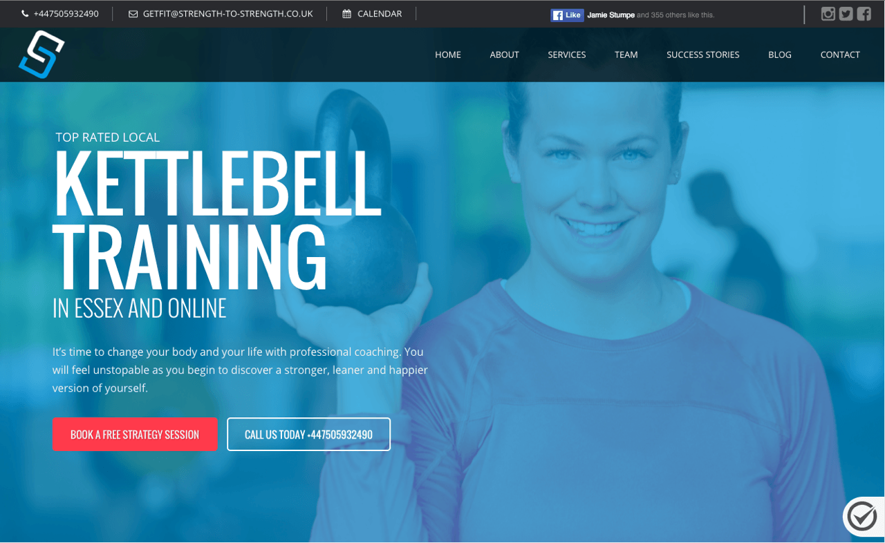
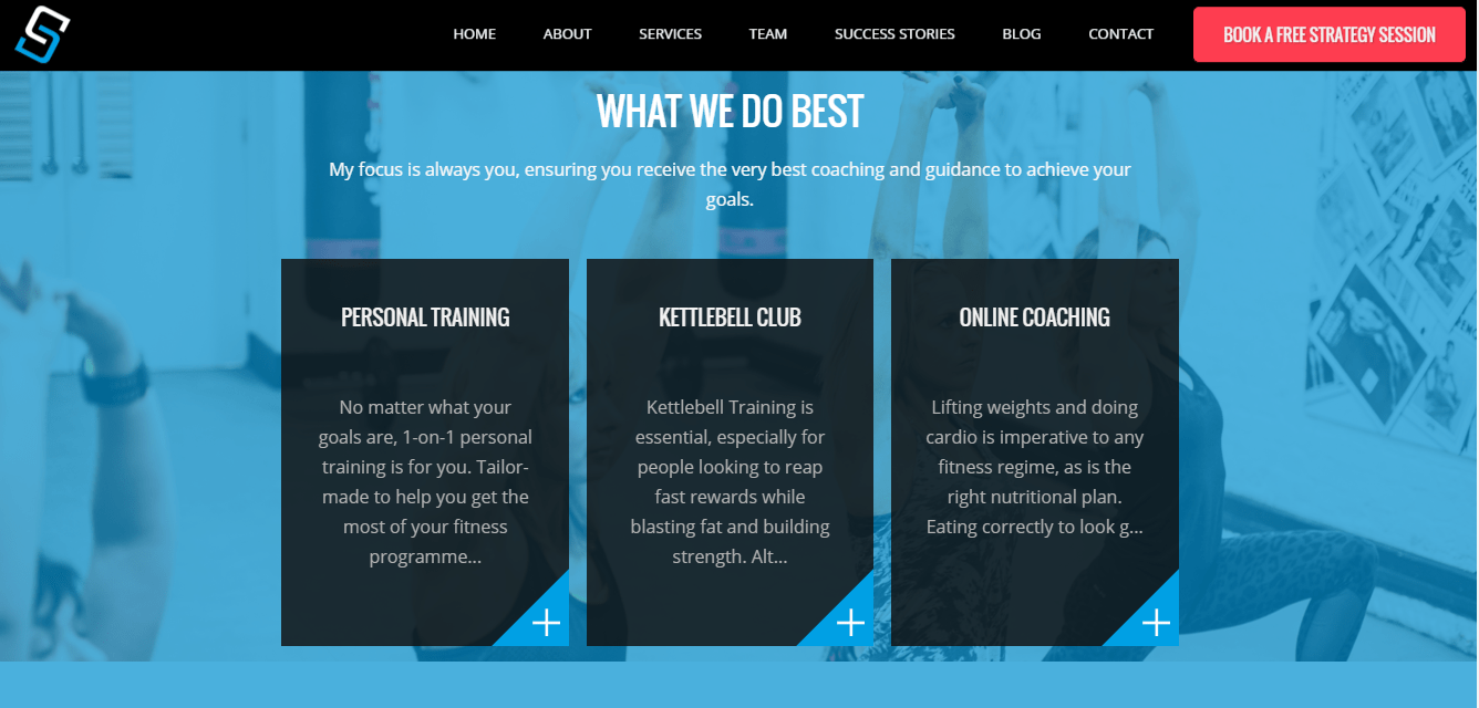
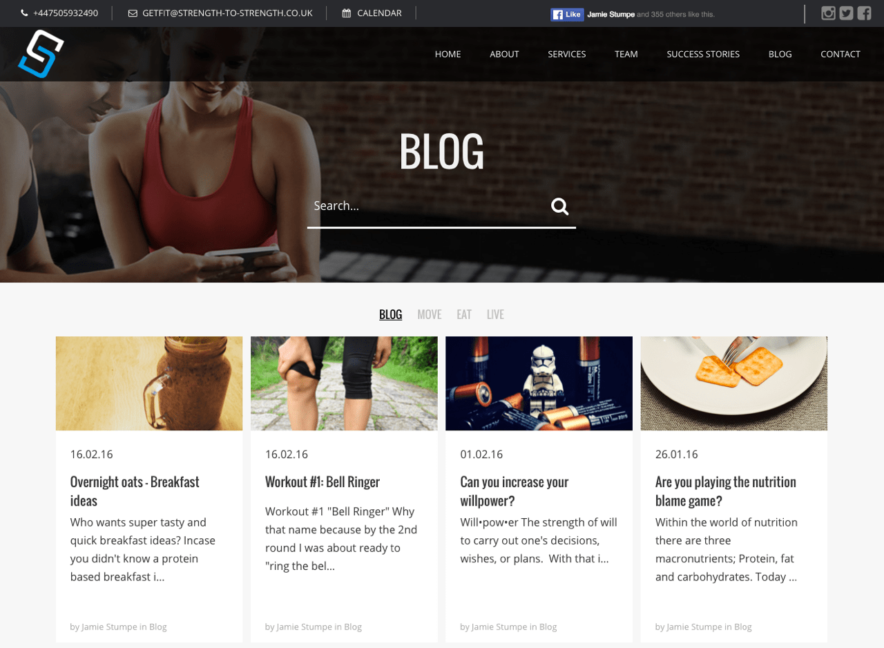
This week, we spoke with Josh Elliot, Creative Director at Start Up Active, a one stop shop for fitness entrepreneurs looking to develop the website they’ve been dreaming of!
We discussed a number of interesting topics related to fitness websites, in particular, Josh shares the most fundamental website mistakes that he sees on a daily basis in his business.
Check it out to make sure you’re not falling victim to these 3 common fitness business website pitfalls!
1. Running Your Entire Business Through Social Media
Each day we see more and more fitness pros and studio owners make an attempt to cut costs by running their entire business through a Facebook page. Although this may seem like a good idea in the short term while you get your website up and running, it’s most definitely not a sustainable long term solution if you want to grow a successful fitness business.
Firstly, by not having a website you’re immediately faced with a struggle to build trust with prospective members. Although Facebook is a great way of generating leads, ultimately prospects wish to have the option to view your information on an alternative, more informative platform such as a website. Not to mention, it can look quite unprofessional if the ‘about us’ section of your social media page does not have a link to your website.
Josh advises that your website should be the hub of everything that you do and that your social media ads and posts should serve to drive traffic to your website and your blog. The fitness market is hyper competitive and you need to think about multiple avenues to generate leads. The key is to have your website as the hub of your online activity, with social media complementing this platform.

The Top 10 Barriers
Slowing Your Fitness
Business Growth
Discover more 2.Not Utilising Your Website as a Business Tool
2017 should be the year you get realistic with your website. If one things for sure, a “brochure” website with a nice theme and pretty stock images of fit people is not going to cut it when it comes to generating business. It’s time to take your website serious and give prospects what they need to see in order to feel confident choosing your business.
Your website should work as a lead generating machine and in order to do this, you have to make sure that your fitness website ticks the fundamental boxes. For example, does your current website provide prospects with a strong, clear and compelling call to action? Does your website contain social proof in terms of customer testimonials of real members achieving real results?
Josh advises that you:
- a) Analyse what your sales funnel currently looks like;
- b) Develop engaging landing page content that will help convert your visitors into leads who are willing to provide you with contact details.
Good landing pages are the foundations to absolutely everything that you want your website to do. Your fitness website should be the best piece of kit in your armour and not just a pretty brochure of your business.

3. Not Having a Clear Website Strategy
When creating your fitness website you should ensure that you have a clear picture in your mind of the type of client that you are trying to attract. Your website should then be designed and structured in accordance with this plan.
Josh advises that once you have developed this target demographic, only then is it time to invest in ads to drive people to your website. People want to feel like they have a connection with you and understanding your target audience and creating content that appeals to them is a crucial component of your marketing strategy.


