Advertising is essential in any business for generating leads and promoting brand awareness. In the fitness industry; it plays a vital part in improving your gym membership sales. Lead generation is often a frustrating process for gym owners, but it’s a process that’s fundamental to the success of your fitness business. It needs just as much attention as any other aspect of the business, and crafting compelling gym ads is a large part of it.
In this article, we’ll highlight why gym ads are worth the investment and everything you need to consider when creating them. We’ve also curated a list of great examples to give you some gym ad ideas, and one major aspect to be careful with.
Why You Need Gym Ads
It doesn’t matter if your studio, staff, and classes are top of the range – if no one knows about them, no one will show up! And your revenue won’t increase if you aren’t consistently growing your customer base.
An effective gym ad is essential for attracting leads; advertising is your tool for inspiring and encouraging new members to get down to your gym. The challenge is creating an ad that stands out from competitors, grabs attention, and resonates with viewers.
How To Create an Effective Gym Ad
When it comes to fitness marketing, it doesn’t matter where you’ll be showing your ad. You might create an entire campaign that you push as a poster series, or it could be social media marketing with Facebook Ads. If your poster content is ‘share-worthy’; make the print-based campaign into a social one by including a hashtag or your studios’ social profile in the copy of your ad.
The possibilities for modern-day advertising are endless, but one thing rings true for any ad campaign: it begins with a strategy.
Plan your Ad
4 aims make up the base of any marketing campaign, and this is known as the AIDA model. The principles should be at the core of your ad. They’ll help to keep you on track in terms of your goals and the creation of the ad itself.
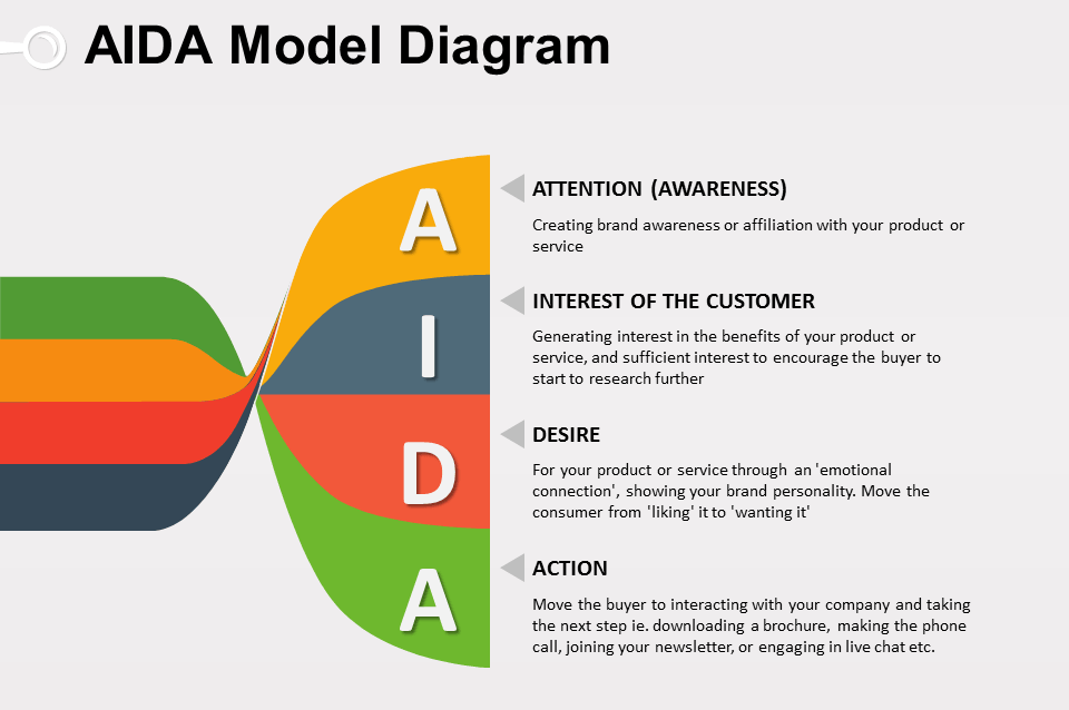
Source: www.professionalshiksha.blogspot.com
- Awareness. Grab the viewer’s attention. Get them to notice your ad.
- Interest. You’ve got their attention; now you want them to read the ad.
- Desire. Persuade them that they want or need what you’re promoting.
- Action. They contact you or get down to your studio.
Missing any of these elements will reduce the chances of your advert achieving what you want. If you miss out on awareness, they won’t even read your ad. If you miss out on desire, they won’t want what you’re offering. There’s nothing worse than getting a prospect’s attention only to have them fall away when there’s no clear direction for them to take.
Set Your Goals
Defining your goal helps to ensure your ad does what it’s meant to do. Whether it’s generating leads, promoting a new class, or raising brand awareness; start by writing down your objective. Knowing what you want to achieve with your ad will also influence the creative content and keep it on track. Having a goal to work towards gives the style of your ad a direction.
Choose Your audience
Is your goal to get new members signed up to your studio? Or maybe, you want people to sign up for one specific class. Once you know your strategy and campaign goals, you can identify who your ad should be tailored to. This will impact ad placement, as well as the design itself.
Plan Your Creative
An excellent gym ad will include a few key elements. As we’ll see in the examples in the next section, the best gym ads let the image or graphics do the talking – especially where any print advertising is concerned. Depending on where your ad is placed; you only have a few seconds to grab a viewer’s attention. The best thing you can do when designing your ad is to keep it simple, especially when it comes to text. People won’t take the time to look at your ad if there’s too much information to digest. This doesn’t mean you have to shy away from creativity but the ad should be easy for someone to absorb in seconds.
A good gym ad will generally include:
- Graphic or image. This should either be the main focus of your advert or complement the copy that you choose.
- Headline. If your image is not intended to be the main focus, your headline is where you grab your audience’s attention.
- Copy. Any text in your ad needs to be easy to understand. As a guide, try to keep it at a level that an 8-year-old can read.
- Call to action. What do you want the viewer to do now they’ve seen your ad? In print advertising, the CTA can be your logo, including your website, or a contact number. For social, you should include a button prompting the viewer to make the next move.
Test Your Ads
The key to creating ads that drive results is to test what works. Create a range of headlines, copy, CTAs, videos, and images and test different combinations. You can do this with both print-based and digital campaigns. For testing posters and flyers, create a sample selection of different combinations. When a prospect comes into your studio after seeing an ad, find out which ad prompted them to do so. For digital, post your ads on Facebook either organically, or with a small amount of money as an A/B test to see what gets the best response. We’ve covered how to use the Facebook Ad Manager and what makes a good Facebook ad previously because the fitness industry has some of the highest conversion rates with Facebook ads – it’s money well spent.
Below, we’ve curated some of the best attention-grabbing gym ads. Some are clever, some use humor, and some do both. You’ll find inspiration for gym ad ideas to suit any budget, big or small. There’s also an example of gym ads gone wrong to highlight the one crucial aspect you need to avoid when creating your ads.
7 Effective Gym Ads That Grab Attention
1. Golds Gym: A Stronger You

This ad is exceptionally visually clever. It differs from some of Gold’s Gyms previous advertisements because this particular example was a project created by a group of students at the School of Visual Arts. The copy accompanying the ad (not pictured) reads, “This is an unconventional ad to demonstrate how strong you can become with Gold’s Gym.” It’s worth noting that for a gym like Gold’s; there is less urgency for a CTA with their traditional print advertising. They’re a large chain with a strong brand presence. And for those who aren’t familiar with the brand; an eye-catching ad like this would certainly have them googling ‘Gold’s Gym’ to find out.
2. Downtown Gyms: Dissuaders

Downtown Gyms went interactive with this smart ad campaign. To promote brand awareness, the business created cement parking dissuaders with handles, that were made out of lightweight expanded polystyrene. The blocks (or rather adverts) were placed in areas that had a Downtown Gym nearby, in a way that obstructed parked cars. When the owners returned to their vehicles, confused at being blocked in, they quickly realized that they were able to lift the “heavy” weight with no effort at all.
The Top 10 Barriers
Slowing Your Fitness
Business Growth
Discover more 3. Powerhouse Gym: Cable Flys
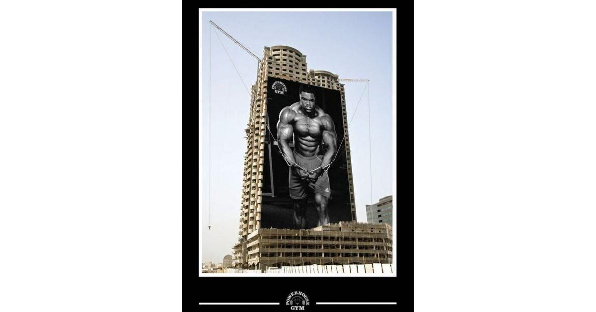
In a series of clever ads, Powerhouse Gym incorporated typical gym interactions with the outside world. While the message itself is not that innovative, the entire campaign revolves around a construction site, giving it massive exposure to the public. In this example, we see a bodybuilder doing cable flys on a fitting double craned construction site, giving the impression that he is lifting a heavy weight. While it’s likely to cause a stir and catch the attention of anyone within a 20-mile radius, it’s clear this ad is targeting those who are into serious lifting – and it does this well with its aspirational style.
4. Funktion Personal Training: Escape your Boring Gym
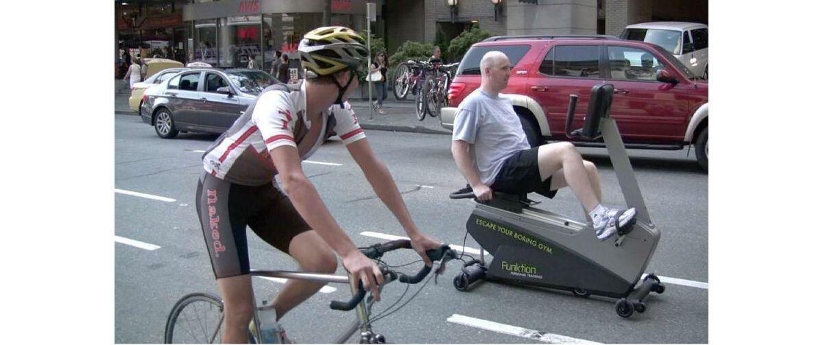
Funktion Training is a fitness business that specializes in outdoor fitness boot camps, hence the fitting tagline for this campaign “escape your boring gym.” This is an excellent example of interactive advertising, and although this instance is quite dated (circa 2009), this type of ad would be even more effective in today’s world. Its humorous, attention-grabbing presence could really pick up some momentum on social media – would you share it if you saw it?
5. World Gym: Run Away
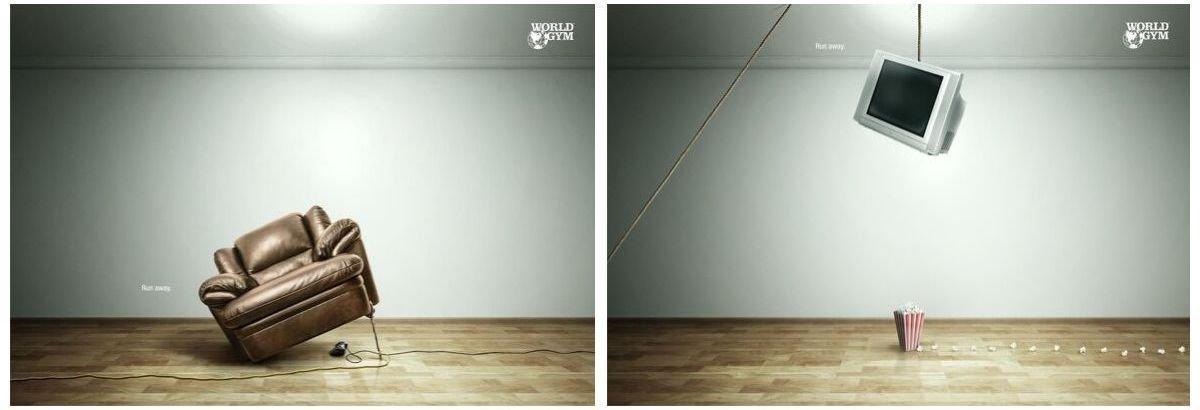
The World Gym ‘run away’ campaigns use humor to resonate with viewers. The scenario depicted is all too familiar for many. You have every intention of going to the gym, but instead, somehow spend your evening on the sofa watching TV. The message is light-hearted and relateable; don’t fall into the trap. Run away and get to the gym! This ad is interesting, as nothing in the image is overtly related to fitness. In fact, the only giveaway is the gym branding in the top right corner. In this case, it works because the ad is memorable. It might not encourage a viewer to take immediate action, but the targeting for this ad seems to be playing more of a long game with its audience. For the many that find the scenario relateable, World Gym will be at the front of their mind the next time they’re about to put off joining a gym (again).
6. Classic Fitness Centre: Belts

This ad from Classic Fitness Centre is simple but effective. What makes it different from the other examples we’ve looked at so far is that this ad has a very niche audience in mind. This is not an ad encouraging people to simply join a gym, or generally get healthier – it’s targeted specifically at people who would be interested in weight-loss. It won’t appeal to a mass audience, but the ad is tasteful in its attempt to appeal to its targeted consumer. Although as we’ll discuss in our final example, this ad probably wouldn’t be as effective in today’s world.
7. Blink Fitness: Every Body Happy
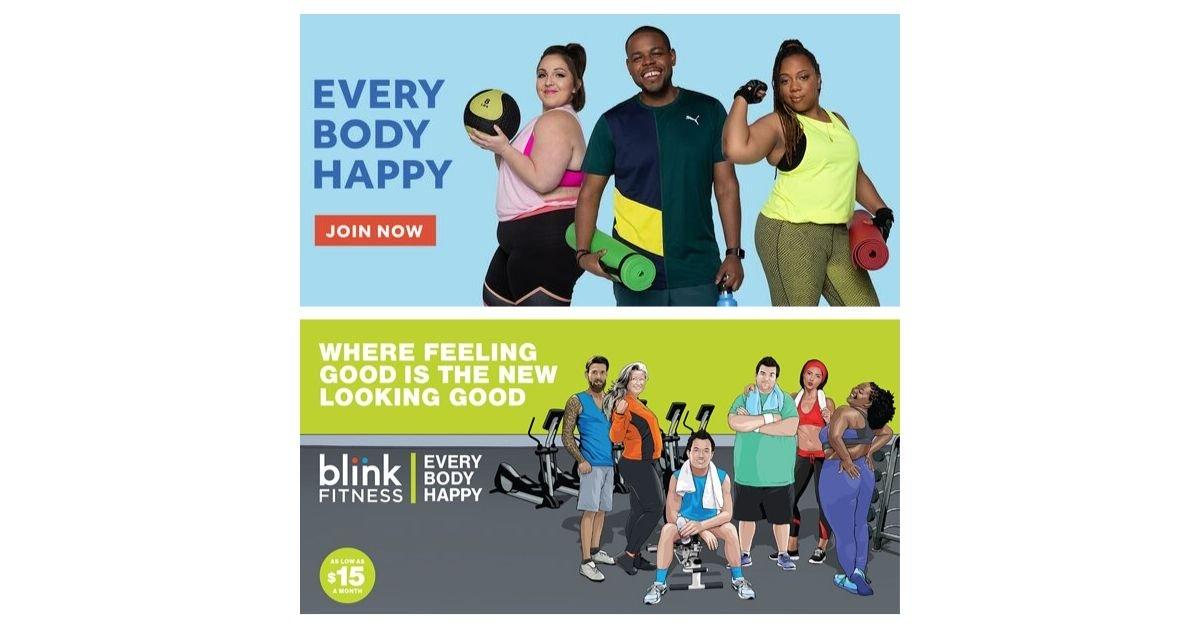
The ad series “Every Body Happy” from Blink Fitness appeals to, well, everybody. Similarly to some of the other campaigns we’ve looked at, the target audience for this ad is quite general. It’s not necessarily aimed at those who consider themselves to be already athletic. The ad is aimed at everyday people, so it features ordinary people: not just bodybuilders or fitness models.
The campaign uses a range of people from average men and women to bodybuilders, and young to old. Everyone is different shapes and sizes, and everyone is happily enjoying exercise. The slogan “Feeling good is the new looking good” works well, especially in 2019 with the growing emphasis on body positivity.
In reality, the majority of today’s potential gym-goers don’t want to join a gym just to look good anymore; they want to feel good. They are striving for health, strength, happiness, and a sense of community – even if that doesn’t come with a 6 pack. As mentioned in 10 Fitness Industry Trends That Could Define 2020; this trend is set to grow. On that note, our final point is the one thing you need to be aware of when creating your gym ads.
One Crucial Aspect to Avoid When Creating a Gym Ad
The ads we’ve focused on so far all have different creative styles and target audiences. Each has been clever in its own way and depicted either an inspirational, aspirational or humorous angle – without causing any viewer offense.
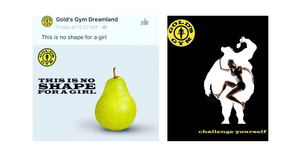
A quick Google search for Gold’s Gym ad brings up a string of articles highlighting the outrage the company caused with the above adverts. They received global criticism after Actress Abigail Breslin posted the photos on Instagram and called out the brand for its campaigns.
It’s a shame, especially considering the quality, creative example from Gold’s that we used at the beginning of this article.
The take away from this final point is to focus your advert on what a person can achieve; not the possible negative aspects of a persons’ physical appearance. Your gym will help people reach their full, happy, healthy potential.
You can be smart, funny, overt, or subtle, but you need to act with today’s world in mind. Act with social awareness. One advertisement made in poor taste could be detrimental to your brand image and cost you a lot of members.
In Summary
When it comes to crafting an effective gym ad, remember to start with a strategy and keep your concept simple. As we’ve seen with the examples listed in this article; simple ideas don’t necessarily mean a lack of creativity! Use advertising as an opportunity to let your brand and your mission shine through. Define your goals to ensure the finished ad is aligned with your business objectives and will deliver the results that you want.
An average gym ad will have someone walk past the advert without even acknowledging it.
A great gym ad will have them walking into your gym.
So when you’ve finished your ad, and you’re ready to show it to the world, ask yourself: Would you keep walking, or would you be signing up?
Table of contents


