Have you ever read a blog post on nutrition and wondered where to buy the right ingredients? Or maybe you’ve seen a video of a cool fitness class but not known where to sign up for it.
That’s because there was no call-to-action.
A call-to-action, or CTA for short, is the most important part of the content you produce because it tells your audience what to do next.
Without a call-to-action, most people will simply read your blog or watch your video and then move on. But with the right CTA, you can put people on the path to hopefully signing up for your gym.
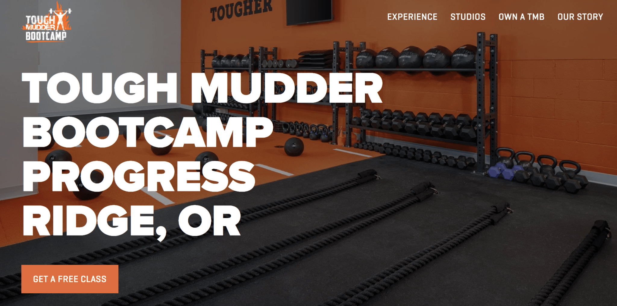
Here are some examples of common calls-to-action:
- Offer readers free advice if people sign up to your mailing list
- Direct your mailing list subscribers to read your latest blog post
- Ask your blog readers to Tweet a specific quote from your post
- Make a time-limited offer on a class that requires them to book a slot now
In this guide, you’ll learn the characteristics of a good CTA and how to construct a solid fitness call-to-action. Master this art, and you’ll be rewarded with more business.
Skip ahead to:
What Makes a Call-To-Action Button Effective?
Not all calls-to-action are equally effective. Often it’s because they don’t offer any real value, aren’t positioned right, or don’ create a sense of urgency. Effective CTAs have certain characteristics in common that you should try to emulate when creating your own.
A good CTA:
Closely ties to the content itself.
- Is simple but compelling
- Clearly explains the next step.
- Uses action phrases such as “Buy Now.”
- Creates a sense of urgency.
- Has a clear button or form to fill out
- Is positioned logically on the website.
- Doesn’t compete with any distracting elements.
Let’s look at how some prominent fitness brands have used CTAs to get more app users, gym members, mailing list subscribers, and customers.
1. Ashy Bines
Ashy Bines is a personal trainer from Australia who has built her own fitness brand. Her company devised a simple, yet very effective call to action for the promotion of their new smartphone app. The ad was a Sponsored Instagram Story video and was only seven seconds long.
But it was enough for Ashy Bines herself to tell people that her new fitness app has everything you need to lose weight and feel great. She ends the video by not only telling people to get the app by swiping up but also physically showing the motion of swiping up. It’s such an effective call-to-action because it makes the next step on the customer journey crystal clear.
2. Fitness World
Fitness World is a Scandinavian gym chain that managed to convert twice as many website visitors to gym members by changing one small thing. They were already doing a great job of selling fitness memberships to visitors, but a quick revision of their gym call-to-action was a game-changer.

The original copy on their home page CTA button said:” Get your membership,” which is already a clear instruction. But by changing up the copy with two action phrases, “Find your gym & get membership,” they increased the click-through-rate by 213,16%. They more than doubled their potential gym members by adding three (relevant) words of copy to their gym call-to-action.
3. Nerd Fitness
Nerd Fitness is a fitness blog dedicated to helping “nerds” get in shape. They’ve used a very solid call-to-action popup on their homepage that urges visitors to sign up for their newsletter. The button itself only says, “I’m in!” but it’s the framing of the CTA that makes it so effective.
First, they boast about their existing community of 300,000 subscribers, which is great social proof. Then they prompt you to “unlock” a bundle of free fitness guides by entering your email. The language speaks directly to their target audience who is already familiar with the concept of “unlocking” levels, items, or characters in games.
4. Peloton
Peloton is a fitness company that sells luxurious exercise bikes for home use. But since not everyone can afford to buy an expensive exercise bike, they have set up a landing page that invites a broader audience to learn more about their product. And that’s exactly what their call-to-action button says: “Learn More.”
But it’s the sentence before the button that makes it so attractive: “Bring the Peloton bike home for no money down.” Not only does the CTA tell their website visitors where they can learn more about the bike, but it also eliminates one of their most common objections to buying it.
How to Create Your Own Fitness Call To Action
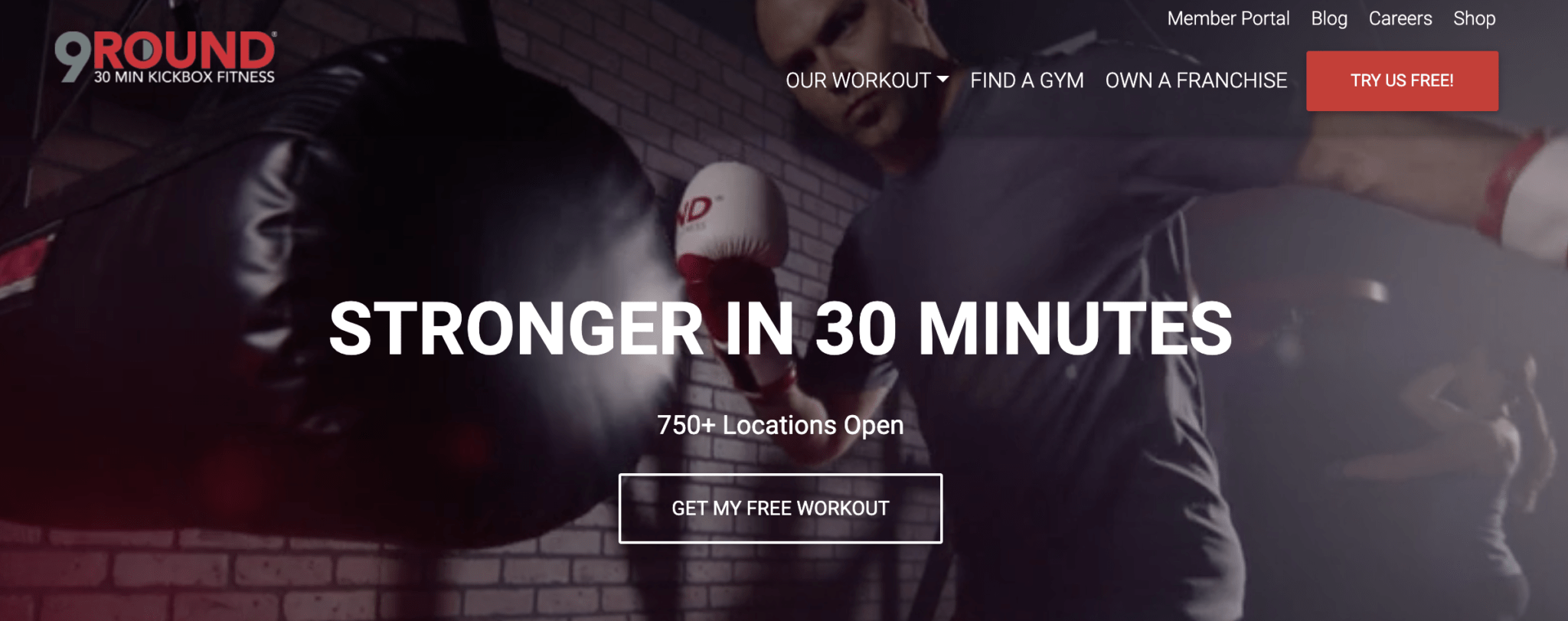
Now that we have gone through how to create an effective CTA with examples, you’re probably eager to write your own fitness call-to-action and convert website visitors into paying customers.
To help you we’ve put together a list of nine tips for how to construct a solid fitness call-to-action. These top tips will help your CTA make sense in the context of your copy, get noticed easily by the reader, and will make them click the magic button that moves them one step closer to becoming a customer.
1. Be Specific
The whole point of a CTA is to guide the readers to take a specific action. That’s why it’s important to be specific in the language you use in your fitness call-to-action so you eliminate any doubt or confusion in the reader’s mind.
Avoid vague language such as “click here” or “book now” unless you’ve already provided a crystal clear context. But even so, it’s always a safer bet to be as specific as possible with the CTA button.
Consider the CTAs “Book now” and “Book your class now” — which one is more specific?
The Top 10 Barriers
Slowing Your Fitness
Business Growth
Discover more 2. Keep it Simple
It’s easy to get carried away with your copy when you want to be specific. For many people, being specific means using more words. Avoid this mistake at all costs. You want to keep the copy in the CTA button to an absolute minimum.
Any benefits and selling points should be elaborated on in the copy before and after the call-to-action. The sole purpose of the clickable button’s copy is to explain what will happen when it’s clicked. That should only require a maximum of five words.
Consider the CTAs “Book your class now” and “Book your class now to receive 50% but only for the next 24 hours” — which one is simpler?
3. Offer Value
The call-to-action should make a promise to your readers. It should offer them a level of value that will make the investment of time and money into your offer worth their time. The value can either be communicated on the CTA button itself or in the copy surrounding it.
If you have several selling points that you want your readers to know about, then it’s best to tell them before the call-to-action. That way, they know about all the benefits and that clicking the CTA button will unlock them.
But you can still include a single benefit in the button copy, such as “Get 50% off now!”
4. Use Compelling Copy
Sometimes a simple value proposition is not enough to prompt your website visitors to take action. That’s when the art of copywriting comes in handy. Make sure that the copy surrounding your call-to-action button is relevant to the reader and compels them to act.
In addition to presenting the benefits, your copy should also frame them in a positive way. You can do that by using verbs such as “enjoy” or “discover.” Finally, your copy can also create a sense of urgency, such as “book now while slots are still available.”
Consider the sentences “First class is free” and “enjoy a free class on us” — which one is more compelling?
5. Make the CTA Button Visible
How specific, simple, valuable, and compelling your call-to-action is won’t matter if your website visitors can’t find the CTA button. Make sure that it’s positioned in a way so that it’s easy to spot (such as a popup) after reading your blog, watching your video, or seeing your ad.
A good way to ensure that your CTA button is visible is to make the CTA button relatively big compared to other elements on your site. You should also make it a color that contrasts with the others. Finally, make sure that it’s not close to other distracting elements on the page.
6. Use the CTA Button Sparingly
Too much of a good thing is often bad, and that holds true for CTA buttons. Although you should not be afraid to provide your visitors with a call-to-action, it also shouldn’t be overdone to the point where it distracts from the main content. After all, that’s what got your visitors there in the first place.
Too many CTAs can also come across as sleazy and salesy, which can put your readers off. That’s why it’s best practice to use calls-to-action sparingly. Be strategic and use them at times and in places where it makes sense to the reader that there should be a next step.
7. Reduce Investment Risk
A call-to-action requires the reader to commit to something. And if they’re completely new to your business, they may not trust you enough just yet. That’s why an effective CTA doesn’t ask for the world, but only a quick action that requires minimal investment.
You could ask your website visitors to sign up for your newsletter and receive free advice directly to their inbox. That doesn’t require them to get their credit card out, but it does give you the opportunity to nurture the relationship.
8. Experiment
There is no magic formula for successful marketing. That’s because every product, service, and audience is unique. In other words, what works for some businesses may not work for you. More importantly, the audience you want to target may have a preference for certain CTAs.
That’s why it’s important to always experiment. Run an A/B test on landing pages, ad copy, popups and CTA buttons to find out which ones perform the best. Even when you’ve found a good recipe, it’s useful to continue testing new calls-to-action in case there’s an even better one you can use.
9. Have Patience
Finally, it’s essential to arm yourself with patience. Drastic changes to your conversion rates won’t happen overnight, and tiny amounts of data won’t tell you the whole story. So when you try out a new landing page, social media ad, or call-to-action, give it time to work its magic.
Make sure that you have all the tools you need to analyze, compare, and contrast your different CTAs. Once you’ve allowed the data to build up, you’ll be able to make an informed decision as to which one will get you the desired results for your conversion rate.
In Summary
You’ve been armed to the teeth with knowledge about what makes a good call-to-action. Now it’s time to put your new-found knowledge into practice.
Here’s a quick recap of what we’ve covered:
- Be specific but keep it simple
- Use compelling copy and provide value
- Make it visible but don’t overdo it
- Test and experiment
- Have patience and analyze
If you’re just starting out, then head over to The Ultimate Guide to Starting a Fitness Blog and learn how to build a solid blog strategy.
Already have a blog you want to promote? Read The Ultimate Guide to Facebook Ads and set up an ad with a compelling fitness call-to-action.


