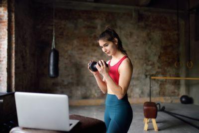
A major update to our Member App is available to fitness enthusiasts worldwide. While we want each update to provide value and make it easier to connect studios and members, this one’s quite special – we’ve given a lot of the application UI a fresh coat of paint, right in time for online classes.
Under the hood, we introduced several performance improvements: cut down on the time it takes to book multiple classes and improved purchasing and payment method management with a brand new Cart. We even looked into how we load days on the Calendar to make sure your members see the value and get booking right away.
The first thing you might notice about the new app is the brand new look and feel of the Schedule screens. Yes – Classes, Courses and Appointments are more on-brand than ever!
One of the most exciting things about being a product designer at Glofox is speaking to you, our customers. It’s so important to learn about where our products help and where they could be improved. Where possible we also visit studios and clubs to observe the day-to-day lives of fitness entrepreneurs, managers and trainers.
During studio visits, we’ve seen how brand-conscious our customers are. We see first hand how the fit-out of their space incorporates the brand colour palette, how proud they are of their merchandise on display, how they’re growing not only a business, but a movement.
This short tutorial is all about how to make the most of the latest Member App update and let your brand and your business shine while your Members get the best possible experience.
What we’ll cover:
- Colour schemes that work for you
- Photography that tells your story
- Illustrations and how to customise them
The best thing about all this? Each section comes with a few handy (free) tools that help you make the app look stunning with minimum effort required.
Let’s get right to it! 💪🏻
How to Pick Your Colours
When setting up your Member App for the first time, you chose 3 colours that best represented your brand. Most likely, those are the colours on your studio’s logo.
A little while ago, we discovered that some of the colour combinations weren’t easily readable and began addressing it.
We call those colours primary, secondary and tertiary. The latest update to the Member App applies them in a manner that’s readable while making sure your brand shines on all of the key screens.
A series of studio visits inspired this greatly. We saw how fitness entrepreneurs brand their spaces, and decided we wanted to match that experience online through better use of colour and photography.
Last, but not least, if you’ve ever tried to decipher a phone screen in glaring sunshine, you’ll immediately know why readability matters. We’ve taken care of that and made sure that any text displayed within the app uses a colour that has enough contrast to read with ease.
When it comes to the setup, nothing has changed. Once you select your three colours, the app does all the work. And the results look a little something like this:
What if you wanted to change the colour palette you’re using? We’re here to help!
While the theory of combining colours can get complex quickly, its practical application is made easy with a few free-to-use tools.
The Canva colour wheel app helps you create colour palettes based on a dominant colour. Select a predefined combination that produces harmonious or contrasting palettes, and copy the values into the Glofox Dashboard for instant impact and perfect brand feel.
What if you don’t know where to start?
The Coolors colour palette generator will help! Just hit spacebar on your laptop and see a new five-colour palette come to life. Hold on to colours you like by “locking” them in place, and keep looking for a perfect combination.
Bonus: grab colours from an image!
Have a colour logo image handy? Recently repainted your studio?
Drop it into this handy tool and let it grab a colour palette straight from a photo.
Working With Images
They say a picture is worth a thousand words.
Images capture attention, evoke emotion and help people recognise familiar places, objects and situations. A class name displayed on a busy schedule might get missed, but a clear image immediately grabs the attention of your members. .
The new Member App update displays images next to your classes, courses and appointments. This helps create a unique experience for your brand and makes it easier for your members to find their favourites or try something new!
We’ve seen our customers use some beautiful and evocative imagery and while a photo session can do wonders to boost your brand and online presence, you can achieve amazing results using photography that’s available for free on the web.
If you can’t think of any images to use, these websites are full of high-quality photography:
https://burst.shopify.com/fitness
https://unsplash.com/s/photos/fitness
https://wunderstock.com/fitness
https://www.pexels.com/search/fitness/
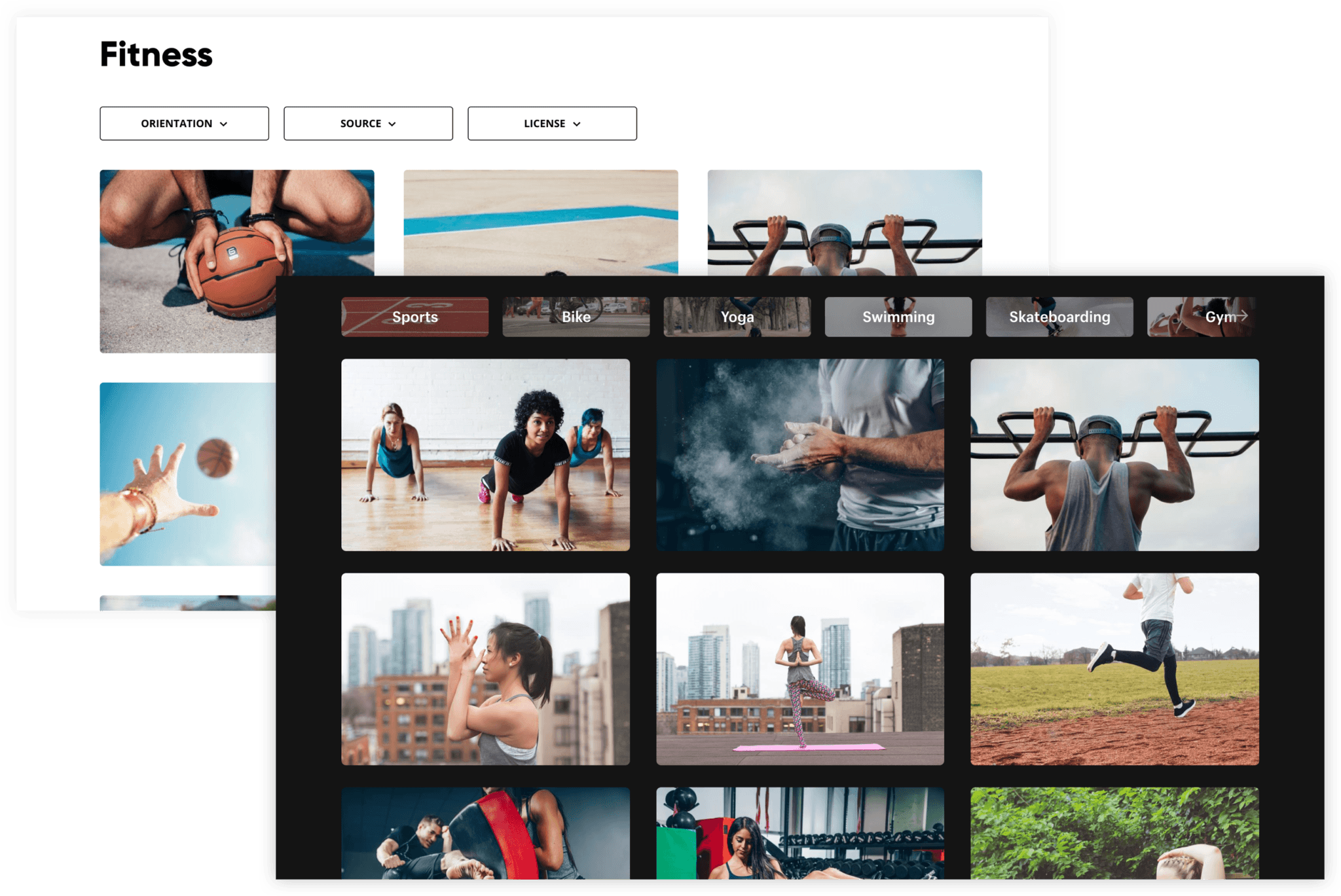
Once you’ve downloaded a selection of photos you’d like to use, you’ll notice some of them are quite big. Large images take longer to download and slow the app down, so we recommend resizing them to approximately 1200px wide and using landscape rather than portrait format.
You don’t have to have image editing software installed to do this – try these free services to resize and crop the photos to your liking:
https://www.img2go.com/resize-image
Try this approach for a couple of classes in your schedule and you’ll see how images add to the slick and modern experience!
Illustrations
What if photos don’t quite capture the feeling you’re after?
Try illustrations!
If you’re struggling to find photos to match your brand, you can always try a customize-it-yourself illustration pack to get started.
Take a look at the amazing unDraw library and try looking for fitness related illustrations. Use them as they are, or adapt the colours to the colour palette of your brand:
Let Us Know What You Think!
I hope this short tutorial will help you make the most of the Member App. More importantly I hope it helps you showcase your studio’s brand in the most impactful way possible. Ease of booking and purchases for your members is extremely important to us, but we also want to help your studio truly shine and create meaningful connections with everyone who uses your studio.
Please let us know what you think about the update at [email protected]!
Links
Image sites list: https://github.com/heyalexej/awesome-images
Illustrations: https://undraw.co/illustrations

